
I only caught George Marsden’s interest once. As an undergraduate hoping to get accepted into Notre Dame’s graduate program in history, I met with Professor Marsden to discuss my research on Dwight Moody’s revivals. As I explained my love of studying history, I told him of how I put my hands directly on the microfilm spool and did not use the levers. I loved “the feel of the reel,” I said. He perked up. It was the only time during our conversation. I didn’t get into Notre Dame.
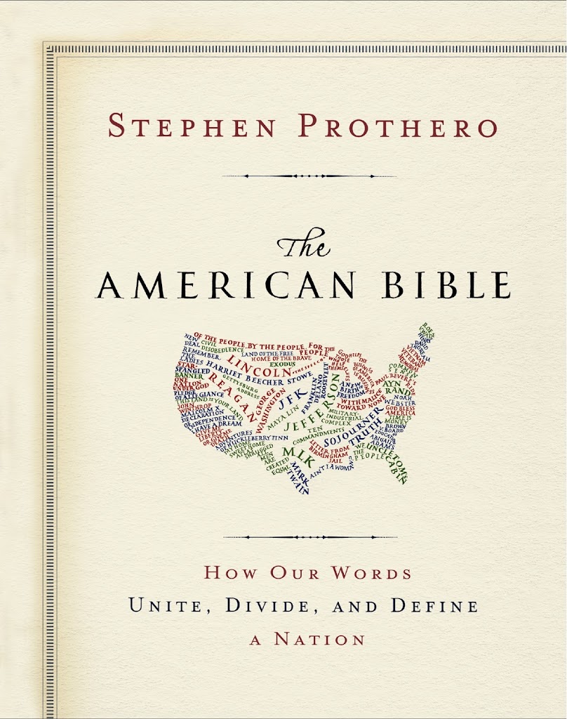 Now as I put my grubby little hands on more books than microfilm reels, I’ve been fascinated with the look of the book. I was thrilled to see Stephen Prothero’s new The American Bible: How Our Words Unite, Divide, and Define a Nation. This is truly a beautiful book. It doesn’t have pictures or prints in it. It doesn’t have snazzy graphs or google ngrams that are so complex beyond their simplicity that we should hold off on using them. The American Bible just has words … but they are beautifully presented words. Prothero takes various passages (like “remember the ladies”) or iconic speeches (like Reagan’s 1964 address) and positions them with sets of commentary. He displays how others have interpreted, used, or abused the passages and then gives his own historical and political commentary. The pages are just delicious to relish. Because of the layout and look, it’s a book I’m proud to own.
Sometimes publishers do not give us the looks we want. Anthony Pinn told me a story of how he wanted an entire chapter just of images for his book Embodiment and the New Shape of Black Theological Thought (2010). “That would have been cool,” I said. “I know,” he replied. But his publisher didn’t think the audience would “get it,” although I think we would have.
And most recently, Paul Harvey and I have our book on images of Jesus in American history coming out, and we discuss literally hundreds of images that could not go in the book. Our decision – build a website with all the texts, images, and tools needed to teach the book (coming soon in September at www.colorofchrist.com). The book is gorgeous, and to have all the images within it would have made it look terrible. But the look of the book matters, I think.
And this brings me to teaching. Does the look of the textbook matter? Do you or your students read the timelines or boxed material? Do you or they look at the images? A certain press (Cengage, cough, cough) just sent me a list of covers for a certain US history textbook (Hist, cough, cough) to help select new covers. I wondered how much that mattered and to whom.
So any textbooks or books work really well for their aesthetic look? Anything publishers do that you cringe at?


This maybe goes without saying, but images that can be used as discussion pieces in lecture are ideal. And, charts with real statistics are excellent. These are great for incorporating discussion into lecture (as they can be thrown up on the screen and everyone should have seen it before), and of course great for section.
One thing I have always wished history textbooks would include in textboxes is a chart of individuals (drawn from social histories) that might be examples of the greater trends discussed in the textbook. I had one professor in college who would do this himself for lecture, and it was fantastic.
Ed, I got the same solicitation about cover images from Cengage. Hope you registered your preferences…
Janine, I’d love to hear more about what you mean. What would a chart of individuals look like? Like a page-sized box that describes, say, for Reconstruction, a history of a freed man, a freed woman (from different states), a southern white elite, and a southern white sharecropper, or something like that? And what would the vertical axis look like? Politics? Income? Social status? Children’s future? I love the idea, and I’d to know what you loved about it.
Care to share more?
Of course I voted; I remember picking one with Reagan and Gorbachev for part 2. I like Janine’s point too … I’ve seen textbooks that open with biographical vignettes of a person who ’embodied’ many of the time period’s issues. I usually had students critique those for what was left out, who, etc. Or perhaps a chart of something like (as hard as these are to get right) things like: expected life span; # of children per family; % voters and actual voters; % of folks in certain occupations). I always like charts and graphs like that … especially for industrial changes and for the always popular question of “what was the white South thinking?” when I show the manufacturing differentials.
I took that Cengage survey too. I told them not to use white male politicians as the signature faces of the past. HIST goes out of its way to deliberately imitate magazines. But I don’t think Cosmo should be the college textbook aesthetic. Sometimes I’ve brought in a stack of freebie textbooks when we’ve needed to compare accounts of something, and when students pick up HIST they tend to feel it’s patronizing and dumbed-down.
It’s interesting that publishers tend to think “readable” text means “broken up into boxes” and “accompanied by lots of pictures.” I’ve been reading Sam Wineburg a lot this week in preparation for a TAH institute I’m running next week, and he calls HS textbooks “800 pages of neon-flashing gimmickry.” But visuals *are* important, not only because they draw the attention of visually-savvy learners, but because images are important historical documents.
Last year I used Davidson’s Experience History and that book has page-sized sidebars called “Historian’s Toolbox” where they do a sort of think-aloud about an object or an image. One of them comes from Lewis Hine’s child labor investigation photographs. At first glance it seems to be a street scene with a factory stack in back, a little girl skipping along, flowers, bushes, almost bucolic. But if you have Hine’s caption, you then know that the little girl has sliced open her hand while working in the factory and is running home in the middle of the day, bleeding and screaming. It’s an awful photo the deeper into it you go, and it’s a great example of how to teach that the image itself is not enough – it helps a lot to know the circumstances of its production, its intended audience, and what archive it comes from. Etc.
Bottom line, I think it’s a fine line between a “pretty” textbook that draws in a reader and a “cluttered” one that chops up knowledge into unintelligible but flashy tidbits. I don’t envy publishers having to walk that line and trying to figure it all out, with profits on the line.
I’m sorry- I hadn’t seen this earlier. Yes, I was thinking something like that– it would be great if a textbook charted a few individuals through events and through time,–yes, in political party, income, who they partner with, where they live, etc. This is too much work for the textbook writers themselves, but often examples can be drawn from social histories already published! It’s of course the way documentaries are made, and I think one of the reasons students say they like movies (fiction) about history but don’t like “textbooks.”
Of course I agree that readable doesn’t mean pretty or flashy or full of boxes and pictures. But, examples of individuals, along with pictures and charts, are I think better remembered than some other aspects of textbooks.
The description of the new Prothero book makes it sound like a page of Talmud — in which the mishna/gemara (the 2 components of rabbinic debate) are in the center of the page and the columns around it and under it are different commentaries. (For example: http://en.wikipedia.org/wiki/File:Talmud_yerushalmi-brakhot.GIF). I’ve often thought this would be a good way to visualize historiography. Event/issue in the center, different interpretations around the sides.