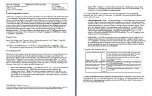
A couple of semesters ago, I reinvented my survey course syllabus. I had been churning out a predictable-looking, text-heavy syllabus every semester. You know the type:
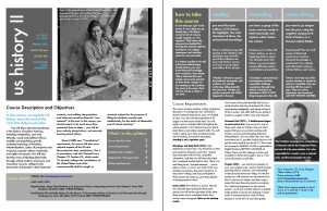
The redesign involved formatting into a magazine-like layout which makes an attractive PDF:
…but I also rethought my survey from the inside out since just presenting the same-old course with a cosmetic upgrade wasn’t enough. At the same time I adopted some graphic design principles (sidebars, varied font, images, and judicious use of color), I also framed the class to give students more responsibility for the learning, including punching some holes in the semester to be filled with student-chosen content later. The process allowed me to think deeper about what I was teaching, what I wanted my students to learn, and how I present that to my students.
As I have reconsidered both the form and function of a college course syllabus and extended my efforts to some of the other courses I teach, I’ve continued to experiment with different looks using stock newsletter templates in Pages for Mac. My aim is to reduce textual clutter, jargon, and bloat and instead give pared-down, readable, technologically savvy syllabi that suggest—at a glance—my personality and the approach of the course. Here are a few, displayed as e-magazines using (free) Flipsnack PDF to Flash converter, which makes it easy to give the links to my students:
- US History II from last semester is no-nonsense with black-and-white images from the Library of Congress (Pages template: Design)
- This term’s version is still serious, but uses more color and has a sharp-looking Q&A back page (Pages template: Financial)
- US Since 1945 is more playful and colorful with a pop-culture edge (Pages template: Modern)
- and Citizen Nation hints at the complex accretion of meanings for American citizenship with a scrapbook-like, vintage layout (Pages template: Collector)
Although prohibitively expensive to print this way, it’s free to share a full-color PDF suitable for my students’ screens and tablets. I still hand out a plain-text “traditional” syllabus in class, but if my students are already accessing most of their course materials online, it makes sense for a version of the syllabus to be well adapted to digital environments. Of course, a syllabus can be reconsidered as something else entirely, such as an infographic or chart, a series of nested digital folders, a Google calendar or Google doc, as Ed mentioned in last week’s comments.
One reader who stumbled on my syllabi this week asked me if I had good ideas about how to replicate the clean look using a PC. I work in the PC environment most of the time, except when I need to craft a syllabus, where Mac has the clear design edge. I don’t have a good answer for this – does anyone have suggestions? Microsoft Office has some passable newsletter templates and you can go a long way with well-designed fonts (try Font Squirrel but just say no to Comic Sans!). Some places offer free newsletter templates for Word-to-PDF conversion. Also, there is an open-source desktop publishing program called Scribus, but it’s probably more than anyone needs or wants for a simple syllabus.
You’re probably thinking what I’m thinking: does all this make the students more likely to READ the darn thing? Who knows. Is it worth it? I’d say yes. Good course design is ALWAYS worth the time we spend, and in my view, a good course deserves a professional-looking or even, I dare say, a beautiful syllabus.
Other recommended resources for syllabus season:
- The University of Minnesota’s fabulous and comprehensive Syllabus Development web tutorial
- World Lecture Hall, offering free online course materials including a wide range of syllabi
- Natalie Houston’s 8/20/12 post for ProfHacker has a roundup of syllabus-creation resources and previous posts, “From the Archives: New Semester, New Year”


Yes please! These are awesome, and you are exactly right about how we market ourselves to our students. Well done. I’m copying you like crazy. Pages, here I come!
i think we can all agree that Tona is now the lead editor for our blog! this is remarkable stuff!!!
Fantastic! I am a junior high social studies teacher, but we have a “Curriculum Night” coming up for our parents and I can’t think of a better way to give an overview of the courses I teach. Hope you don’t mind if I use some of your ideas.
Please do!
An exploratory factor analysis could be interesting.
http://www.surveytool.com/health-care-surveys/
Wow! amazing blog regarding design forward syllabus. Thanks for sharing such a nice post.
Flip Book
I stumbled upon this while trying to update the syllabi for my chemistry course. I can’t wait to try this!
Awesome idea and excellent product!
Your argument for a visually appealing syllabus was persuasive and the examples you provided were inspirational. Thanks to you, my social psychology syllabus now captures the excitement I have for the material.